

 chart
timeline
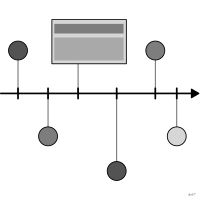
Events laid out along a time axis.
Classification
- chart
- timelines
- change over time; Financial Times Visual Vocabulary
Channels
 position on common scale; main: date
 spatial region; secondary: event category
 color hue; secondary: category
Attestation
- English definition: Data Visualisation Guide, data.europa.eu
Scientific literature
Seminal references
- first known use (1200) Pierre de Poitiers (late 12th century). Compendium historiae in genealogia Christi; Cartographies of Time
- first known use (1474) Rolevinck (1474). Fasciculus temporum; Cartographies of Time
- diffusion (1765) Priestley (1765). A Chart of Biography; Friendly & Denis 2001, Andrews 2017
R packages
- R
vistime::gg_vistime(); GitHub 175 stars; last commit 2026-03
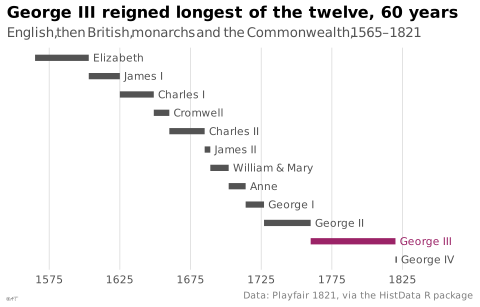
R code of the ggplot2 example
library(ggplot2)
library(dplyr)
library(HistData)
## The reigns Playfair drew under his chart of wheat prices and wages.
reigns <- Wheat.monarchs |>
mutate(name = recode(name, `W&M` = "William & Mary"),
row = rev(seq_along(name)),
longest = end - start == max(end - start))
p <- ggplot(reigns, aes(y = row)) +
geom_segment(aes(x = start, xend = end, colour = longest), linewidth = 2.2) +
geom_text(aes(x = end + 3, label = name, colour = longest), hjust = 0, size = 2.8) +
scale_colour_manual(values = c(`FALSE` = "#535353", `TRUE` = "#9b2367")) +
scale_x_continuous(breaks = seq(1575, 1825, by = 50), limits = c(1560, 1860)) +
scale_y_continuous(NULL, breaks = NULL) +
labs(title = "George III reigned longest of the twelve, 60 years",
subtitle = "English, then British, monarchs and the Commonwealth, 1565–1821",
x = NULL,
caption = "Data: Playfair 1821, via the HistData R package") +
theme_lex_viz(grid = "x", arrows = "") +
theme(legend.position = "none")Sources (68)
603 occurrences in the corpus; indexed by 9 books
Show the 68 sources
- 100 diagrams that changed the world: from the earliest cave paintings to the innovation...
- analysisfunction.civilservice.gov.uk
- app.flourish.studio
- Atlas of knowledge: anyone can map
- Ault, Nam Liao & Musolino, Principles of Data Science, OpenStax, 2025
- behance.net↗
- Better data visualizations: a guide for scholars, researchers, and wonks
- Bremer & Barone, Chart, CRC Press, 2025
- Building Science Graphics: An Illustrated Guide to Communicating Science through Diagra...
- buildingsciencegraphics.com
- Cartographies of Time
- Cartography: thematic map design
- Data Feminism
- Data points: visualization that means something
- Data sketches
- Data Visualisation Guide, data.europa.eu
- Data visualisation: a handbook for data driven design
- Data visualization handbook
- Data Viz Project
- Data-driven storytelling
- dataphys.org
- datavis.ca↗
- datavizcatalogue.com
- datavizproject.com
- datawrapper.de↗
- Dear data
- Design for information: an introduction to the histories, theories, and best practices ...
- Effective data storytelling: how to drive change with data, narrative, and visuals
- Effective data visualization: the right chart for the right data
- Exploratory Data Analysis: Descriptive Analysis, Visualization, and Dashboard Design (w...
- Friendly & Wainer, A History of Data Visualization and Graphic Communication, Harvard University Press, 2021
- Fundamentals of computer graphics
- github.com↗
- Handling and mapping geographic information
- Impossible to ignore: creating memorable content to influence decisions
- Info we trust: how to inspire the world with data
- Information graphics
- Interactive data visualization: foundations, techniques, and applications
- js.histropedia.com↗
- LibreTexts Statistics, textbook chapters on charts
- Living in data: a citizen's guide to a better information
- Milestones in the history of thematic cartography, statistical graphics, and data visua...
- Open Visualization Academy, courses and newsletter (Cairo et al.)
- Questions in Dataviz: A Design-Driven Process for Data Visualisation
- Seeing with fresh eyes: meaning, space, data, truth
- Show me the numbers: designing tables and graphs to enlighten
- Storytelling with data: let's practice!
- The art of insight: how great visualization designers think
- The big book of dashboards: visualizing your data using real-world business scenarios
- The book of circles: visualizing spheres of knowledge
- The book of trees: visualizing branches of knowledge
- The functional art: an introduction to information graphics and visualization
- The golden age of data visualization: how did we get here?
- The grammar of graphics
- The infographic history of the world
- The Minard System: The Complete Statistical Graphics of Charles-Joseph Minard
- The Oxford Handbook of Empirical Aesthetics
- The Truthful Art: Data, Charts, and Maps for Communication
- The Wall Street journal guide to information graphics: the dos and don'ts of presenting...
- Thematic Cartography and Geovisualization
- Visualization Analysis and Design
- Visualization of Time-Oriented Data
- Visualize This
- Visualizing with text
- Wikipedia — Data and information visualization
- Wikipedia in English↗
- xeno.graphics↗
- xkcd.com↗
Cite this entry
Stable addresshttps://dataviz.adrientaudiere.com/en-only/term/timeline.html
ReferenceTaudière Adrien. 2026. timeline. In Visualization Vocabulary, version 1.0.0. IdEst. https://dataviz.adrientaudiere.com/en-only/term/timeline.html
BibTeX
@incollection{taudiere2026-timeline,
  author    = {Taudière, Adrien},
  title     = {timeline},
  booktitle = {Visualization Vocabulary},
  year      = {2026},
  version   = {1.0.0},
  publisher = {IdEst},
  url       = {https://dataviz.adrientaudiere.com/en-only/term/timeline.html},
  note      = {CC0 1.0}
}Page created on 2026-10-13. Text last changed on 2026-11-02. Images last changed on 2026-11-09. Numbers computed on 2026-10-22.