

 chart
pie chart
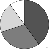
also: sector chart, circle chart, divided circleDisc split into sectors proportional to parts of a whole.
diagramme sectoriel
aussi : graphique sectoriel, camembert, diagramme circulaireDisque découpé en secteurs proportionnels à des parts d'un tout.
« Camembert » est familier mais très répandu. « Diagramme circulaire » lui est parfois préféré, au risque d'une confusion avec le diagramme en accords que Lagnel nomme ainsi.
Classification
- chart
- sectors, tilings and units › sectors
- part-to-whole; Financial Times Visual Vocabulary
- the name evokes: food
Channels
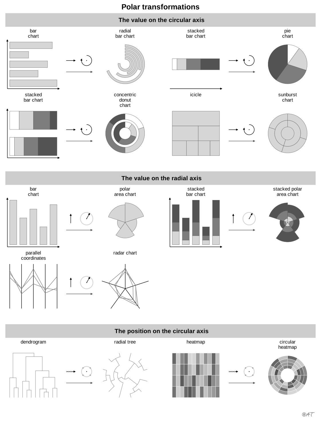
 tilt/angle; main: share; Munzner 2014
 area; main: share (Munzner: area marks and angle channel); Munzner 2014
 color hue; main: category; Munzner 2014
Variants
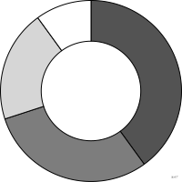 donut charthollow center
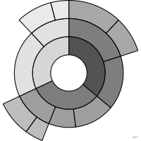 sunbursthierarchical
Attestation and synonyms
- French term: Lagnel, Manuel de datavisualisation, Dunod, 2021
- English definition: Brinton, Graphic Presentation, 1939↗
- sector chart; Brinton, Graphic Presentation, 1939↗
- circle chart; Brinton, Graphic Presentation, 1939↗
- divided circle; Brinton, Graphic Presentation, 1939↗
- camembert; Lagnel, Manuel de datavisualisation, Dunod, 2021
Scientific literature
OpenAlex: 8 421 papers since 1878, 40% in the last five years; mostly in Social Sciences, Medicine, Computer Science; Wikidata
Seminal references
- first known use (1801) Playfair (1801). The Statistical Breviary; Friendly & Denis 2001, Andrews 2017, Ciuccarelli 2026
R packages
- R
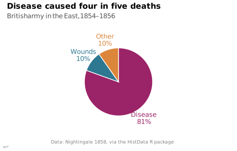
ggplot2::coord_polar(); GitHub 7 025 stars; last commit 2026-10; paper (33 455 citations) Avec geom_col et theta = "y".
R code of the ggplot2 example
library(ggplot2)
library(dplyr)
library(tidyr)
library(HistData)
deaths <- Nightingale |>
summarise(across(c(Disease, Wounds, Other), sum)) |>
pivot_longer(everything(), names_to = "cause", values_to = "n") |>
mutate(cause = factor(cause, levels = cause),
label = paste0(cause, "\n", scales::percent(n / sum(n), accuracy = 1)))
p <- ggplot(deaths, aes(x = "", y = n, fill = cause)) +
geom_col(width = 1, colour = "white", linewidth = 0.5) +
geom_text(aes(x = 1.8, label = label, colour = cause), position = position_stack(vjust = 0.5),
size = 3.5, lineheight = 0.9) +
coord_polar(theta = "y", direction = -1) +
labs(title = "Disease caused four in five deaths",
subtitle = "British army in the East, 1854–1856",
x = NULL, y = NULL,
caption = "Data: Nightingale 1858, via the HistData R package") +
theme_lex_viz(grid = "", arrows = "") +
theme(legend.position = "none", axis.text = element_blank())Sources (81)
644 occurrences in the corpus; indexed by 23 books
Show the 81 sources
- 100 diagrams that changed the world: from the earliest cave paintings to the innovation...
- analysisfunction.civilservice.gov.uk
- app.flourish.studio
- Applied Multivariate Statistics in R
- Atlas of knowledge: anyone can map
- Ault, Nam Liao & Musolino, Principles of Data Science, OpenStax, 2025
- Better data visualizations: a guide for scholars, researchers, and wonks
- Bremer & Barone, Chart, CRC Press, 2025
- Brinton, Graphic Presentation, 1939↗
- Cartography: thematic map design
- Ciccione et al., The Superiority of Graphics over Text in Long-Term Memory Retention, Psychonomic Bulletin & Review, 2025↗
- Data Feminism
- Data fluency: empowering your organization with effective data communication
- Data points: visualization that means something
- Data sketches
- Data story: explain data and inspire action through story
- Data Visualisation Guide, data.europa.eu
- Data visualisation: a handbook for data driven design
- Data visualization handbook
- Data visualization: a practical introduction
- Data Viz Project
- data-to-viz.com
- datavis.ca↗
- datavizproject.com
- datawrapper.de↗
- Design for information: an introduction to the histories, theories, and best practices ...
- Effective data storytelling: how to drive change with data, narrative, and visuals
- Effective data visualization: the right chart for the right data
- Exploratory Data Analysis: Descriptive Analysis, Visualization, and Dashboard Design (w...
- Friendly & Wainer, A History of Data Visualization and Graphic Communication, Harvard University Press, 2021
- From data to viz
- Graphic presentation
- Graphical Perception: Theory, Experimentation, and Application to the Development of Gr...
- Graphics for learning: proven guidelines for planning, designing, and evaluating visual...
- Handling and mapping geographic information
- How charts lie: getting smarter about visual information
- Info we trust: how to inspire the world with data
- Information graphics
- Information Graphics: A Comprehensive Illustrated Reference
- Interactive data visualization: foundations, techniques, and applications
- Lagnel, Manuel de datavisualisation, Dunod, 2021
- Les fondamentaux de la visualisation de données
- LibreTexts Statistics, textbook chapters on charts
- Making and Breaking the Grid, Third Edition
- Manuel de datavisualisation - 2e éd, vol. 2
- Milestones in the history of thematic cartography, statistical graphics, and data visua...
- More Practical Charts
- Open Visualization Academy, courses and newsletter (Cairo et al.)
- Practical charts: the essential guide to creating clear, compelling charts for reports ...
- python-graph-gallery.com
- Questions in Dataviz: A Design-Driven Process for Data Visualisation
- Seeing with fresh eyes: meaning, space, data, truth
- Semiology of graphics: diagrams, networks, maps
- Show me the numbers: designing tables and graphs to enlighten
- StatsLearn, “Graphs and displays” glossary↗
- Storytelling with data: let's practice!
- The art of insight: how great visualization designers think
- The big book of dashboards: visualizing your data using real-world business scenarios
- The book of circles: visualizing spheres of knowledge
- The book of trees: visualizing branches of knowledge
- The elements of graphing data
- The functional art: an introduction to information graphics and visualization
- The golden age of data visualization: how did we get here?
- The grammar of graphics
- The Minard System: The Complete Statistical Graphics of Charles-Joseph Minard
- The Truthful Art: Data, Charts, and Maps for Communication
- The visual display of quantitative information
- The Wall Street journal guide to information graphics: the dos and don'ts of presenting...
- Thematic Cartography and Geovisualization
- Visual complexity: mapping patterns of information
- Visual strategies for biological data
- Visualization Analysis and Design
- Visualization of Time-Oriented Data
- Visualize This
- Visualizing Uncertainty About the Future
- Visualizing with text
- Wainer & Friendly, On the Origins of Data Visualization, 2022
- Wickham, Çetinkaya-Rundel & Grolemund, R for Data Science, 2nd ed., 2023
- Wickham, Navarro & Pedersen, ggplot2: Elegant Graphics for Data Analysis, 3rd ed. online↗
- Wikipedia — Data and information visualization
- Wilke, Fundamentals of Data Visualization, O'Reilly, 2019
Cite this entry
Stable addresshttps://dataviz.adrientaudiere.com/en/term/pie-chart.html
ReferenceTaudière Adrien. 2026. pie chart. In Visualization Vocabulary, version 1.0.0. IdEst. https://dataviz.adrientaudiere.com/en/term/pie-chart.html
BibTeX
@incollection{taudiere2026-pie-chart,
  author    = {Taudière, Adrien},
  title     = {pie chart},
  booktitle = {Visualization Vocabulary},
  year      = {2026},
  version   = {1.0.0},
  publisher = {IdEst},
  url       = {https://dataviz.adrientaudiere.com/en/term/pie-chart.html},
  note      = {CC0 1.0}
}Page created on 2026-10-13. Text last changed on 2026-11-02. Images last changed on 2026-11-12. Numbers computed on 2026-10-22.