


 chart
Sankey diagram
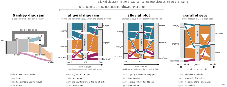
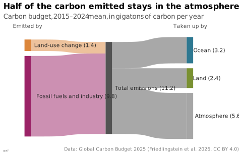
Flows whose width encodes a quantity conserved between stages.
diagramme de Sankey
Flux dont l'épaisseur code une quantité conservée entre étapes.
Classification
- chart
- flows › ribbon flows
- flow; Financial Times Visual Vocabulary
- the name evokes: eponym
Channels
 length; main: volume of the flow (ribbon thickness)
 area; secondary: count of each level and each flow
 spatial region; main: stage and node
 color hue; secondary: origin of the flow
Variants
 alluvial diagramordered stages in columns
Attestation
- French term: Lagnel, Manuel de datavisualisation, Dunod, 2021
- English definition: Data Visualisation Guide, data.europa.eu
Scientific literature
OpenAlex: 1 824 papers since 1990, 69% in the last five years; mostly in Medicine, Environmental Science, Computer Science; Wikidata
Seminal references
- first known use (1869) Minard (1869). Carte figurative des pertes successives en hommes de l'armée française dans la campagne de Russie 1812-1813; Ciuccarelli 2026
- naming (1898) Kennedy & Sankey (1898). The thermal efficiency of steam engines: report of the committee. Minutes of the Proceedings of the Institution of Civil Engineers (69 citations); Andrews 2017, Ciuccarelli 2026
R packages
R code of the ggplot2 example
library(ggplot2)
library(dplyr)
library(ggsankey) # on GitHub only: pak::pak("davidsjoberg/ggsankey")
## The global carbon budget, mean of 2015-2024 (GtC per year), from the
## Global Carbon Budget 2025: what is emitted, then where it goes. Fossil
## emissions include the cement carbonation sink; the budget imbalance,
## under 0.1 GtC, is left out.
sources <- c(`Fossil fuels and industry` = 9.8, `Land-use change` = 1.4)
sinks <- c(Atmosphere = 5.6, Ocean = 3.2, Land = 2.4)
## One row per tenth of a gigatonne: the quantity is conserved from one
## stage to the next, and every row passes through the total.
carbon <- tibble(source = rep(names(sources), round(10 * sources)),
total = "Total emissions",
sink = rep(names(sinks), round(10 * sinks)))
values <- c(sources, `Total emissions` = sum(sources), sinks)
flows <- make_long(carbon, source, total, sink) |>
mutate(label = paste0(node, " (", sprintf("%.1f", values[node]), ")"))
p <- ggplot(flows, aes(x = x, next_x = next_x, node = node, next_node = next_node,
fill = node, label = label)) +
geom_sankey(flow.alpha = 0.5, node.color = NA, width = 0.08, space = 6) +
geom_sankey_text(hjust = -0.12, space = 6, size = 2.8, colour = "#262626") +
scale_fill_manual(values = c(`Fossil fuels and industry` = "#9b2367", `Land-use change` = "#dc863b",
`Total emissions` = "#535353", Atmosphere = "#a6a6a6",
Ocean = "#2e7891", Land = "#7a9132")) +
scale_x_discrete(labels = c(source = "Emitted by", total = "", sink = "Taken up by"),
position = "top", expand = expansion(add = c(0.3, 0.6))) +
labs(title = "Half of the carbon emitted stays in the atmosphere",
subtitle = "Carbon budget, 2015–2024 mean, in gigatons of carbon per year",
x = NULL, y = NULL,
caption = "Data: Global Carbon Budget 2025 (Friedlingstein et al. 2026, CC BY 4.0)") +
theme_lex_viz(grid = "", arrows = "") +
theme(legend.position = "none", axis.text.y = element_blank())Sources (28)
60 occurrences in the corpus; indexed by 8 books
Show the 28 sources
- app.flourish.studio
- Atlas of knowledge: anyone can map
- Better data visualizations: a guide for scholars, researchers, and wonks
- Bremer & Barone, Chart, CRC Press, 2025
- Data Visualisation Guide, data.europa.eu
- Data visualisation: a handbook for data driven design
- Data visualization handbook
- Data Viz Project
- data-to-viz.com
- dataphys.org
- datavizcatalogue.com
- datavizproject.com
- datawrapper.de↗
- Design for information: an introduction to the histories, theories, and best practices ...
- Effective data storytelling: how to drive change with data, narrative, and visuals
- Effective data visualization: the right chart for the right data
- Exploratory Data Analysis: Descriptive Analysis, Visualization, and Dashboard Design (w...
- French Wikipedia↗
- From data to viz
- Lagnel, Manuel de datavisualisation, Dunod, 2021
- Larmarange et al., analyse-R: introduction to survey analysis with R
- Larmarange, guide-R: analysing survey data with R
- Open Visualization Academy, courses and newsletter (Cairo et al.)
- The Truthful Art: Data, Charts, and Maps for Communication
- Thematic Cartography and Geovisualization
- Visualization of Time-Oriented Data
- Wikipedia — Data and information visualization
- Wikipedia in English↗
Cite this entry
Stable addresshttps://dataviz.adrientaudiere.com/en/term/sankey-diagram.html
ReferenceTaudière Adrien. 2026. Sankey diagram. In Visualization Vocabulary, version 1.0.0. IdEst. https://dataviz.adrientaudiere.com/en/term/sankey-diagram.html
BibTeX
@incollection{taudiere2026-sankey-diagram,
  author    = {Taudière, Adrien},
  title     = {Sankey diagram},
  booktitle = {Visualization Vocabulary},
  year      = {2026},
  version   = {1.0.0},
  publisher = {IdEst},
  url       = {https://dataviz.adrientaudiere.com/en/term/sankey-diagram.html},
  note      = {CC0 1.0}
}Page created on 2026-10-13. Text last changed on 2026-11-12. Images last changed on 2026-11-12. Numbers computed on 2026-10-22.